THE ANCIENT OLIVE TREE > Teatro e Marionetas de Mandrágora
Infographics: The Art of Making Data Visible
Every day, we are drowning in information. Emails, news, and social media notifications hit our brains like a constant rainstorm. To make sense of it all, we can't just read lists of dense facts, we need to see them.
An infographic is a translation. It takes cold data and turns it into a visual story. It works because our brains are built for pictures. Infographics bridge the gap between numbers and humans. We remember 65% of what we see, but only 10% of what we read.
Think of an old radio object. When you are between stations, all you hear is static—that is Noise. When you find the right frequency, the music comes through clearly — that is the Signal.
The job of an artist is to act as a volume knob. They turn down the noise (the boring, unnecessary details) and turn up the signal (the important truth). They make the most important information "pop" so you don't have to go hunting for it.
Before we had written words, we had images. We are hard-wired to understand symbols. When an artist creates an infographic, they are using a "Visual Alphabet" and by using these symbols, an infographic can explain a complex idea to someone even if they don't speak the same language. It turns a "math problem" into an "emotional experience". Great infographics aren't just pretty; they are a journey. They lead your eye from the "Start" to the "Conclusion" without you even realizing it. This is why infographics are considered a form of Modern Art.
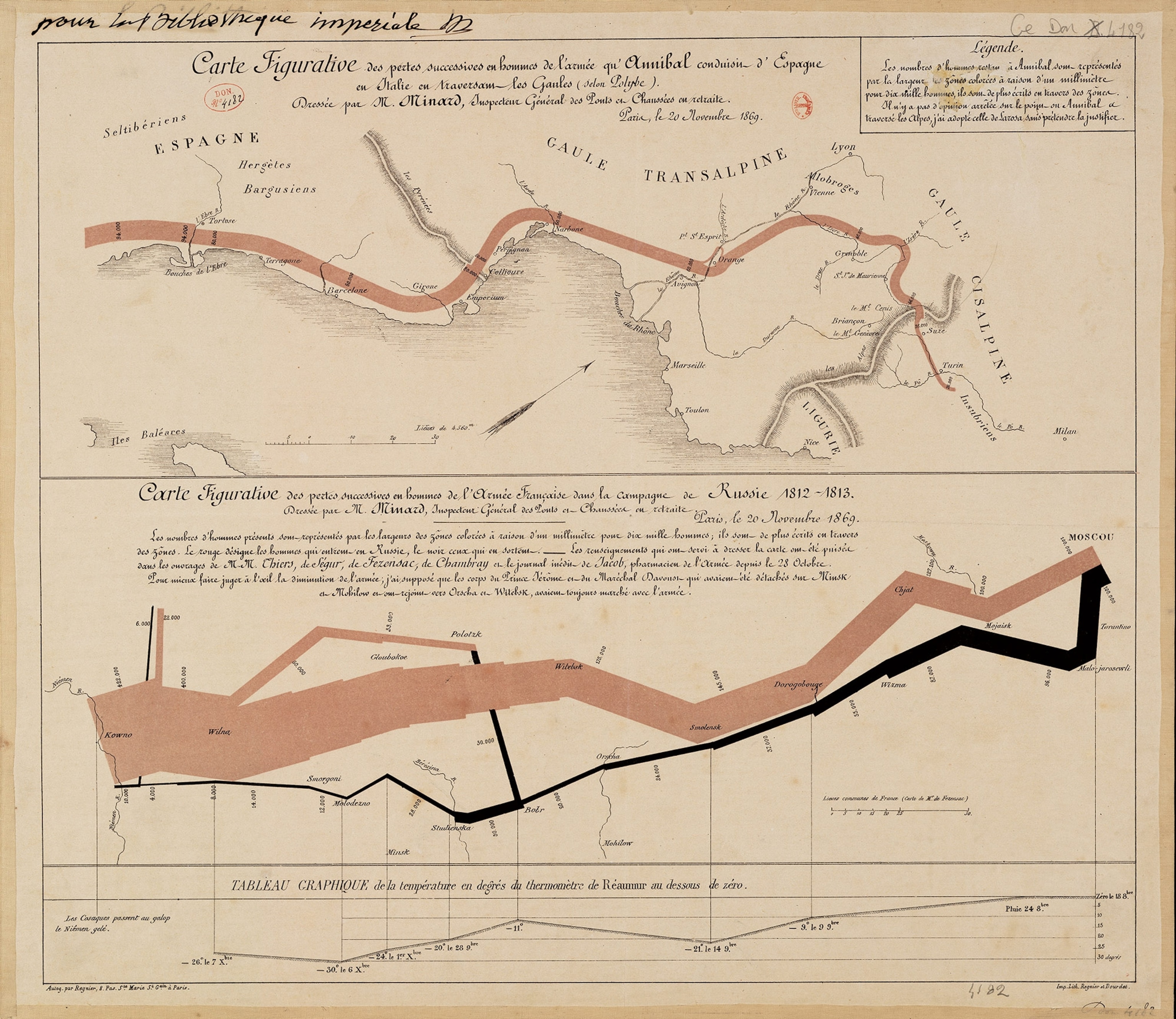
One of the most famous examples of "Data Art" is Charles Minard’s map of Napoleon’s 1812 Russian Campaign. Instead of just listing how many soldiers died, the artist used a single, shrinking band of color. As you look at the band moving across the map, it gets thinner and thinner. You don't need to read a history book to feel the tragedy — you can see the army disappearing. This is where an infographic stops being a chart and starts being a masterpiece of storytelling.